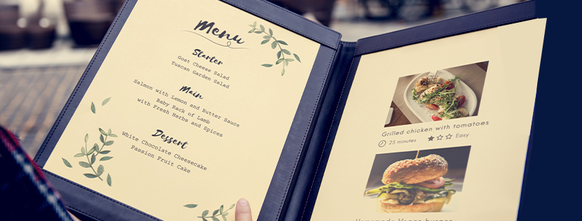
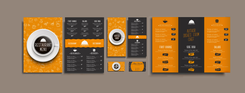
The first impression is usually the most important, and if you run a restaurant or café, it is absolutely so! When a new diner walks into your establishment the primary aspect that will formulate their first impression is not the food itself or the décor, but rather, the menu card.
When a new diner picks up the menu card at a restaurant they are not simply going through the list of dishes. They are looking at the entire presentation of it if any specials are available, and other such additional aspects. The menu card builds an idea of the food in one’s psyche, and it is your job as the restaurateur to ensure this idea is built to perfection.
This is why restaurants often take to unique ideas while designing their menu. If you are having a hard time figuring out how to revamp your menu card or create a unique one, here are 5 amazing ideas for creating restaurant menu cards that you can try.
This can be easily achieved using the inresto DineIn. With its digital menu option, you not only enable every customer to safely access your menu but also allows you to change the menu design without incurring a huge cost.
1. A Separate Specials Section

Usually, it is the first page of the menu card that holds the ‘special’ dishes served by your establishment. While this does the job perfectly, a better idea is to have this section separately printed for everyone to look at even before they open the menu. This increases the attraction towards the specials section, and also creates a unique impression of your restaurant. After all, the special dishes served by your restaurant creates its unique identity, so it is common that you would like more diners to order out of the specials menu.
How and where you present the specials menu is also important. You can have it on multiple walls, on the table, and even on a standee outside. If the number of items in your specials menu are less, then you can opt for the wall or the standee as your medium; but if you are serving various special dishes then use a separate table menu. Many restaurants also use a chalkboard to depict their special menu as it is easy to update. You can also opt to present any interesting offers as part of your special menu as well.
2. Culture-centric
If your establishment serves exclusive cuisines such as Chinese or Indian, you can have the whole menu themed to match the cultural aspects of these cuisines. On the other hand, a multi-cuisine restaurant can divide their menu into parts, and design each section based on its corresponding cultural themes. If a diner has walked into a restaurant that serves a particular type of cuisine, it is best to allow them to understand and visualize what their food will look and taste like. This is best done through presenting the theme of the cuisine in the menu card.
This boosts the cultural aspect of the establishment as well and allows the diner to feel more welcome towards ordering out of their comfort zone. You can also include small excerpts that describe said culture, as it can be a fun read while waiting for the food.
3. A Picturesque Menu

A restaurant menu card does not have to be a few black and white pages with food items and corresponding prices on it. The menu is something that diners look at for a lengthy period of time, thus it should be as engaging as possible.
An easy way to achieve this is by including graphics in your menu that suit the nature of your establishment and cuisine. But always make sure that the menu does not look cluttered. Hire a professional graphics designer to get this job done and you should have a perfect menu card in no time.
4. Pick A Theme

A theme-based menu, although seen quite often, can be a great idea if you make it unique. The current world has shown us that a restaurant can be themed around anything, from the animal kingdom to Harry Potter. So, design your menu to match the theme of your restaurant, or pick a separate theme for your menu only.
Keep in mind that the theme should connect with your primary diner base. So, if you are a diner then you probably should not pick a Disney or Harry Potter theme. A sunset boulevard theme might do wonders for a diner. Make sure that your theme is as original as possible.
5. The Old School

Sometimes a diner visits a restaurant because they associate with the feel of the place, and an overdone menu can throw them off. If you are a regular restaurant you can always stick to the old school style of creating a menu card. An old school menu with properly arranged sections in multiple pages is a welcoming notion to a diner. And they will also be able to find exactly what they are looking for with ease.
But this does not mean it has to be boring, from the font to the arrangement and description of the dishes, every aspect can be made engaging while keeping the old school feel intact.
Use Your Menu to Create an Identity
If your restaurant serves a unique identity before it serves the food then the diner is highly likely to remember your establishment. And if the food is great, you already have a returning diner! People revisit restaurants not simply because they had liked the food, but also because they remember a certain aspect of it clearly.
Use these 5 menu ideas to create something unique for your restaurant menu card, and engage the diner to create the best first impression possible. This will not only boost your business, but also create a unique business persona that serves as a competitive edge. You can also choose to mix these ideas and create something completely new that fits the vibe of your restaurant.
The key factor here is to make the process welcoming to your diner. If a menu is overdone it can easily throw someone off, so keep that in mind!

